Selecting an appropriate colour scheme is a critical decision during the renovation or remodeling of a home office. The colours one chooses can have a significant impact on a person’s mood and productivity. With today’s surge in remote working, the home office has transformed from a space of occasional use to a daily professional hub.
.
It’s essential that the colour palette not only suits personal preferences but also fosters an environment conducive to work. Integrating colours that blend well with natural light can create an atmosphere that is both energizing and serene, contributing positively to work efficiency and comfort.
.
I get commissions for purchases made through links in this post.
While bright and bold hues might stimulate creativity and energy for some, others might find neutral tones conducive to focus and concentration. A personalized colour scheme allows individuals to tailor their home office to fit their unique work style and needs.
.
Considering the psychological impact of colours can guide homeowners in their selection process, ensuring that the colours chosen promote a desired state of mind. For instance, blue is often associated with calmness and can aid in concentration, while green is said to reduce eye strain during long hours of screen time.
.
Additionally, the rise in virtual meetings necessitates consideration of how a colour scheme will appear on camera. The backdrop of a home office can communicate professionalism and taste, making it important to select colours that aren’t distracting and that complement one’s professional image.
.
Whether one leans towards warmer shades to add a sense of comfort or cooler tones to maintain a formal atmosphere, the ultimate goal is to create a dedicated workspace that resonates with one’s personal brand and meets the demands of working from home.
Understanding Colour Psychology
When renovating a home office, understanding the psychological effects of colours can guide the choice of a suitable colour scheme that enhances mood and productivity.
Emotional Impact of Colours
Colours have a significant influence on a person’s emotions and behaviours. Here are some common colours and their associated emotional impacts:
- Blue: Often seen as calming and stable, which can lead to increased focus and productivity.
- Green: Associated with balance and restoration, ideal for stress relief during work hours.
- Yellow: Evokes optimism and energy, which can stimulate creativity and innovation.
- Red: A powerful colour that can increase energy levels but may also elevate stress if used excessively.
By integrating these colours, one can create a personalized colour scheme that caters to the emotional well-being of the individual utilizing the space.
Colour Temperature and Mood
Colours are also categorized by temperature, with each range influencing mood and atmosphere in the home office:
| Temperature | Colours | Mood Impact |
| Warm | Red, Oranges | Stimulating, and energizing, can be overpowering in large quantities |
| Cool | Blues, Greens | Relaxing, focus-enhancing, good for sustained work periods |
Natural light plays a critical role and should be considered when selecting a colour palette. It can alter the perceived temperature and intensity of colours.
- Neutral tones like grey, white, or beige can help focus and serve as a backdrop for virtual meetings without visual distraction.
Selecting the right colour temperature scheme is essential for creating a functional and comfortable home office environment that supports their various tasks.
Assessing Your Space and Lighting
When renovating a home office, understanding the interplay between space, light, and colour is crucial in creating an environment that enhances productivity and well-being.
Evaluating Natural Light
The amount of natural light a home office receives sets the stage for choosing an optimal colour scheme. Bright, well-lit spaces can handle a wider range of colours, including darker hues, without becoming oppressive. Conversely, offices with limited natural light benefit from lighter, reflective colours to make the space feel more open. Determine the direction your windows face:
- North-facing windows: Often receive consistent, cool light. Ideal for warm colours.
- South-facing windows: Abundant daylight brings flexibility in colour choice.
- East-facing windows: Warm, bright light in the morning. Lighter colours work well.
- West-facing windows: Intense afternoon light and cooler colours can balance this.
Considering Office Size and Layout
The dimensions and arrangement of the home office should guide colour selection:
- Smaller spaces: Lighter and more reflective hues can make them appear larger.
- Larger offices: Darker tones can add warmth and create a more intimate atmosphere.
When considering the layout, remember that colour can influence perception. Vertical stripes or lighter colours give the illusion of higher ceilings, while horizontal stripes make a room feel wider. For a home office used in virtual meetings, the backdrop is significant. A neutral tone or calm colour behind the workstation can provide a professional setting for video calls. For personalized colour schemes:
- Desk location: Choose a colour that doesn’t clash with natural light on the workspace.
- Shelving and storage areas: Subtle colours can help these blend into the surroundings.
Check your office at different times of the day to see how changing light affects colours and consider the psychology of colour when selecting hues to ensure they align with the desired functionality and emotional response of the office.
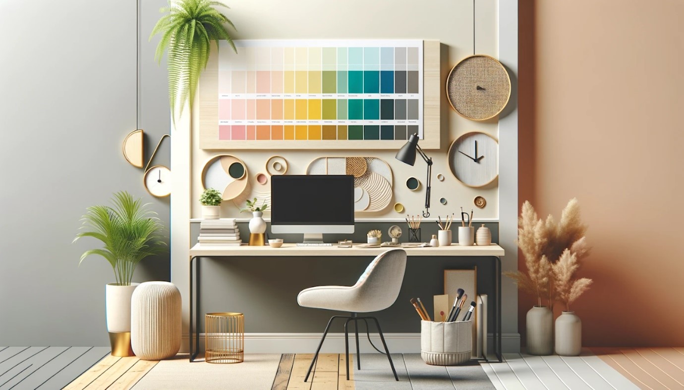
Colour Scheme Basics
When renovating a home office, selecting the right colour scheme is crucial for enhancing productivity and ensuring the space meets individual preferences. A well-chosen palette can also complement natural light, create a suitable background for virtual meetings, and positively influence one’s psychological state.
Colour Wheel and Combinations
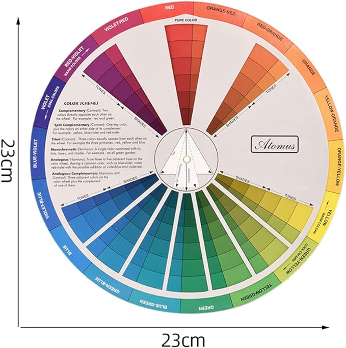
A colour wheel is an essential tool for understanding how different hues relate to each other. It showcases primary colours (red, blue, yellow), secondary colours (green, orange, purple), and tertiary colours which are mixes of the primary and secondary. Using the wheel, one can create harmonious combinations:
- Complementary Colours: Opposite each other for high contrast and vibrancy.
- Analogous Colours: Next to each other for a more harmonious and subtle look.
- Triadic Colours: Evenly spaced around the wheel to offer a balanced contrast.
Monochromatic vs. Contrast
- Monochromatic Schemes: These utilise variations in lightness and saturation of a single colour, creating a cohesive and calming aesthetic ideal for focus. They can be enriched by integrating varying textures and materials.
- Contrasting Schemes: A contrast scheme leverages colours from different segments of the colour wheel. For a home office, one should opt for contrasts that stimulate without overwhelming, such as pairing a dominant neutral tone with a bold accent for energy.
Adding Accent Colours
Accent colours can transform a home office from mundane to personalized and stylish. They should be employed strategically to draw attention without causing distraction:
- Strategic Placement: Use accents for highlighting bookcases, artwork, or furniture.
- Consistency: Maintain a consistent palette for cohesion, leaning on neutral tones where necessary.
- Virtual Backdrops: For video calls, choose accents that look professional and are not distracting on camera.
This approach to selecting colour schemes will help create a home office that is both aesthetically pleasing and conducive to productivity.
Implementing Your Colour Scheme
Choosing the right colour scheme is vital for creating a productive and aesthetically pleasing home office. Colours can influence mood and focus, so it’s essential to select shades that enhance work efficiency and match personal taste.
Selecting Paints and Finishes
When selecting paints, homeowners should consider the psychological impact of colours. For walls, neutral tones such as beige, light grey, or white can promote focus and make the room feel spacious. It’s beneficial to choose paints with a matte or eggshell finish, as they minimize glare from natural light, which can be a distraction during work hours.
- Low VOC Paints: Opt for low VOC (volatile organic compounds) paints for better indoor air quality.
- Accent Wall: Consider a bolder colour for an accent wall that reflects personality without overwhelming the space.
For finishes, durability is key since home offices can see a lot of wear and tear.
Coordinating Furniture and Decor
Furniture and decor must complement the chosen paint colours to create a cohesive work environment. Pieces that incorporate personalized colour schemes can make the space more inviting, while still maintaining a professional backdrop for virtual meetings.
Furniture Colours:
- Desk: A wood finish or black for a classic, timeless look.
- Chair: A pop of colour like blue or green can energize the space without being overpowering.
Décor Tips:
- Wall Art: Select art pieces that resonate with the colour scheme and personal style.
- Shelving Units: Use these not only for storage but also to display decorative items that tie into the office’s colour palette.
Textiles like curtains and rugs should balance colour with function, offering the right amount of light filtration and comfort underfoot.
Frequently Asked Questions:
Choosing the right colour scheme is pivotal in creating a conducive work environment at home. Factors such as natural light availability and individual preference play significant roles. This section aims to answer common questions on selecting colours for productivity, relaxation, and professional appeal in a home office setting.
What factors should be considered to select colours that enhance productivity in a home office?
When selecting colours to enhance productivity, it is important to assess the amount of natural light in the office and to consider personalised colour schemes that energize one’s mood. Bright and moderate hues like soft blues and greens are often recommended for their calming and focusing effects.
What are some relaxing colour choices for a home office to help reduce stress?
For a home office aimed at reducing stress, colours that evoke tranquillity, such as muted blues, gentle greens, or soft lavenders, can be beneficial. These hues are associated with nature and have a psychological impact on stress reduction.
How can the 60-30-10 colour rule be applied in the context of an office renovation?
The 60-30-10 rule is a classic decorating principle that suggests using 60% of a dominant colour, 30% of a secondary colour, and 10% of an accent colour. In a home office, this might translate to neutral beige walls, wood furniture, and a pop of colour like teal or terracotta in accessories.
Could you suggest a neutral colour palette that is suitable for a professional home office environment?
A neutral colour palette for a professional office might include shades of grey, taupe, or cream. These tones create a focused atmosphere and serve as a versatile backdrop for virtual meetings, blending seamlessly with various decorative elements.
What are effective strategies for incorporating an accent wall within a home office space?
Incorporating an accent wall should be done thoughtfully to avoid overpowering the space. Choose a wall that receives good natural light or one that serves as a backdrop during virtual meetings. Use a bold colour or textured wallpaper to create a focal point without distracting from the work at hand.
How can colour theory guide the selection of a colour scheme that enhances concentration in a home office?
Colour theory suggests that cool tones, such as blues and greens, typically foster concentration and calmness. Selecting a colour scheme with these hues can create a serene environment that supports focus, especially when paired with consistent home office elements.
.
In conclusion, selecting the right colour scheme for your home office is crucial to create a productive and inspiring work environment. You will need to consider your personal preferences, any natural light, the current furniture and psychological effects of colours on mood. The right colour scheme will ultimately contribute to a more fulfilling, professional and successful work experience. If you need help with the configuration of your home office take a look at this article.
Pingback: 5 things every home office needs- essentials - the home office renovations